bimmerpost/
G87 / G42
BMW M2 and 2-Series Coupe
| 08-09-2008, 12:35 AM | #1 |
|
Banned
104
Rep 2,528
Posts
Drives: 95 Avus M3 and 07 E90 Fam Car!
Join Date: Nov 2006
Location: So Cal, Simi Valley
|
New Business cards designed!!!***CHECK IT OUT***
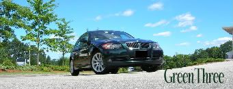
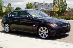
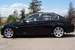
Hey guys I just got new Business cards designed. Let me know what you think. Which do you prefer, the one with the front of the car (A) or the one with the side of the car (B)? I personally like (A) much better.
Thank you and kind regards, Richy Last edited by BMW MotorSport; 08-18-2008 at 06:56 PM.. |
|
|
| 08-09-2008, 12:36 AM | #2 |
|
¡Viva España!
394
Rep 7,803
Posts |
I like A as well.

__________________
24 G20 330i Skyscraper Gray Metallic Black, Open Pore Fine Wood Oak Grain Interior Trim MODS Clear Guard, 15% Ceramic Tint, Floating Caps
|
|
Appreciate
0
|
| 08-09-2008, 12:55 AM | #6 |
|
Banned
104
Rep 2,528
Posts
Drives: 95 Avus M3 and 07 E90 Fam Car!
Join Date: Nov 2006
Location: So Cal, Simi Valley
|
|
|
Appreciate
0
|
| 08-09-2008, 01:12 AM | #7 |
|
Go Terps!
55
Rep 1,375
Posts
Drives: 2009 SSII/FR E92 M3
Join Date: Dec 2006
Location: Jersey City, NJ Gaithersburg, MD
|
I prefer B because I like how the text fits right around the rear of the car. It looks cleaner that way imo. Either way you can't lose though, it's really a win-win

__________________
 |
|
Appreciate
0
|
| 08-09-2008, 04:34 AM | #9 |
|
Lieutenant General
   
1234
Rep 12,446
Posts |
A is the better design imo. I also noticed that you erased some of the tri-colored tire decals so it would fit the e92 in A so that in B it has an uneven bottom.
Anyways, A is more appealing, but the text is set in a busy area, making it hard to read. Try blurring the background beneath the text or something. Just my .02.
__________________
Past: '08 E92 335i|ZPP|ZSP|6AT
Past: '15 Mustang GT|401A|PP|6MT Current: '20 Shelby GT350|6MT |
|
Appreciate
0
|
| 08-09-2008, 06:58 AM | #10 |
|
Colonel
 216
Rep 2,110
Posts |
I like it. Looks alot more interesting than my biz card! LOL.
A
__________________
 2015 335xi | Mineral Grey Metallic | Black Dakota Leather | NAV | SportLine | ZPP | ZDA | ZCW | Munich Build Retired: 2008, 2011, 2013 328xi |
|
Appreciate
0
|
| 08-09-2008, 11:02 AM | #11 |
|
Second Lieutenant
 
39
Rep 270
Posts |
Both are very nice. Great job
 However, as a graphic designer I would alter the text with a different color stroke or something so that it's easier to read. Otherwise I think it's great. However, as a graphic designer I would alter the text with a different color stroke or something so that it's easier to read. Otherwise I think it's great. |
|
Appreciate
0
|
| 08-09-2008, 12:37 PM | #14 |
|
Major
 
119
Rep 1,252
Posts |
Well. A is looking like the winner.
It is certainly my choice. 'A' all the wAy 
__________________
 If you're not living on the edge, you're taking up too much space.  |
|
Appreciate
0
|
| 08-09-2008, 01:54 PM | #17 |
|
General
    
392
Rep 21,745
Posts
Drives: E92 335i TiAg/E46 323i TiAg
Join Date: Mar 2007
Location: CA
|
Hey Richy,
"A" looks better. I don't like the fact that "B" has a silhouette of some guy driving. 
__________________
07 E92 335i | TiAg | Step | Padl | Cmft | Alum Trm | PDC | Nav | Assist | Sat | Lthr | Prem | Sprt | Rear Splr | RDSport Quads | iPod | V1 | LT Refl | VS Clear Bra | OEM Lip | KWV2 | Mtec Sides | BBS LM-R
00 E46 323i | TiAg | 5sp | Sport | Roof | RDSport Cams | RDSport tune | RDSport Shift | Volk LE37 | M3 spoiler | PSS9 | SuperSprint | Brembo  |
|
Appreciate
0
|
| 08-09-2008, 01:55 PM | #18 |
|
Major
 
90
Rep 1,032
Posts
Drives: 2006 330i & 2010 535i
Join Date: Jun 2006
Location: Sunnyvale/Tracy, Ca
|
A looks good to me

__________________
  2006 330i Jet Black w/ Beige Leather/Sport/Prem/Step/Shades/Xenon/Logic 7 |
|
Appreciate
0
|
| 08-09-2008, 03:27 PM | #19 |
|
Second Lieutenant
 46
Rep 295
Posts |
Boooring.
Why don't you try something different. Look into getting a die cut card (a bit more expensive but worth it). If your specialise in wheels or tires, why don't you get it done on a piece of rubber with tread on one side and your details on the other. Or give the card the look and feel of tire marks. Alternatively, create a key ring that looks like a stylish alloy - with one side having your contact number etched on it. Many a time your business card is your "face". |
|
Appreciate
0
|
| 08-09-2008, 04:22 PM | #20 |
|
Major
 
361
Rep 1,149
Posts |
I have to agree with the post above.. I do this kinda stuff every day so your business card looks very elementary to me. Plus you are not allowed to use those photos for business purposes lol.
|
|
Appreciate
0
|
| 08-09-2008, 06:22 PM | #22 |
|
Second Lieutenant
 34
Rep 234
Posts |
Not for me..
Looks like some hookers cards to me... When I see colored cards.. i toss it to the bin generally.. they are too loud. Dont get me wrong though.. Lot of guys out here liked it anyway.
__________________
E90 / Monaco Blue / Terra / Dark Burl / Steptronic / Sport / Premium / Nav / Cold Weather / Comfort Access
|
|
Appreciate
0
|
 |
| Bookmarks |
|
|